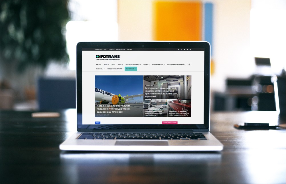
When we were contacted by the partner we had done a few successful projects for and offered us to create a logistics portal, our first question was about building upon the existing solutions.
We were very enthralled and fascinated by the idea of this portal. Its content was to be formed by a community of experts who actively participate in the market processes. It is not simply copypasted from a news feed in the sphere of logistics, but real analytical materials that help professionals in solving pressing matters.
So, our client had the name and designing the logo became our first task.
A logo is the reflection of the company, a visual part of the brand that is the first one to be seen by a customer. Several people always take part in designing a symbol: a brainstorm, a business subject analysis, and, necessarily, a competition analysis are conducted.
In this sphere, logos and websites of the rivals were really “aged” and outdated. Therefore, the task of building up was super-easy.
Together with our client, we determined the color palette: the classical black with a hint of bright blue and green symbolizing land and air transport.
A solid and rugged font symbolizes the team’s certainty and the global nature of its work. Additionally, we “encrypted” an arrow sign in the font solution. The arrow looks to the right and symbolizes moving forward and adds some dynamic.
The guys don’t like superfluous words. Quick solutions, clear-cut plans. All this found its representation in the logo.

